7 Timeless Color Palettes That Make Any Home Feel Cozy
If you've ever walked into a home that instantly felt calm, welcoming, and beautifully put together, chances are the color palette had something to do with it.
The right combination of colors can completely transform a space—making it feel brighter, cozier, larger, or more relaxing. The best part? You don't need a full renovation to create that feeling! A few thoughtful color choices in your walls, furniture, textiles, and décor can make all the difference.
Choosing the right home color palette can completely change how a room feels. Whether you're decorating a cozy living room, updating your bedroom, or designing an entire home, the right combination of colors creates warmth, balance, and personality. These timeless interior color palettes work beautifully in modern, farmhouse, Scandinavian, organic modern, and transitional homes!
1. Warm White + Natural Wood + Olive Green

Natural tones and textures make this space feel relaxed and pulled-together.
This palette is effortlessly calming and works beautifully in almost every home style, from Scandinavian to organic modern.
The combination of warm whites, natural wood tones, and soft olive greens creates a fresh, lived-in look that feels inviting year-round.
Works well with:
Oak furniture
Linen curtains
Woven baskets
Ceramic planters
Indoor plants
2. Cream + Camel + Black Accents

Pops of black make this space feel grounded without overwhelming darkness! The leggy coffee table keeps the space air-y while the more substantial black planter and cabinet connect to the black accents around the room to give balance to the eye.
If you love clean, sophisticated spaces, this palette strikes the perfect balance.
Cream keeps the room bright, camel adds warmth and richness, while black accents provide just enough contrast to make everything feel intentional.
Try incorporating black through picture frames, lighting, or hardware instead of large furniture pieces.
3. Greige + Sage Green + Linen

Greige… The perfect neutral!
Greige continues to be one of the most versatile neutral colors because it blends warm and cool undertones beautifully.
Pair it with muted sage green and natural linen fabrics for a relaxed, spa-like atmosphere that feels peaceful without looking bland.
4. Soft Taupe + Terracotta + Cream

For those that gravitate towards warmer colors, terracotta tones can range from a light almost-neutral to a deep brownish red that gives drama to the space! I love this patterned rug that pulls together the paint color and the bowls/vases on the table.
Earthy colors bring warmth and character into a home without feeling overwhelming.
Terracotta works especially well in planters, pillows, artwork, and pottery, adding just enough color while maintaining a timeless aesthetic.
Houseplants look especially beautiful against this palette.
5. Warm Beige + Dusty Blue + Walnut

Walnut brown is a great wood tone for those who gravitate towards light colored linens but don’t want a room that is overwhelmingly beige. Walnut can give your space the darker hue that it needs and adding a few shades of dusty blue from the same family help bring coolness to the space!
If you're looking for something a little more colorful while still feeling classic, dusty blue is an excellent choice.
Combined with warm beige and rich walnut wood, the result is cozy, elegant, and perfect for both traditional and transitional homes.
6. Charcoal + White + Natural Oak

Arguably my favorite color palette! This kitchen is saturated with charcoal tones from the cabinetry to the pendant lighting but it feels balanced with white countertops and warm natural oak shelving, island and barstools.
Dark colors don't have to make a room feel heavy.
When charcoal is balanced with crisp whites and natural oak finishes, it creates a sophisticated look that still feels bright and welcoming.
This palette works particularly well in modern and minimalist homes.
7. Sand + Moss Green + Stone
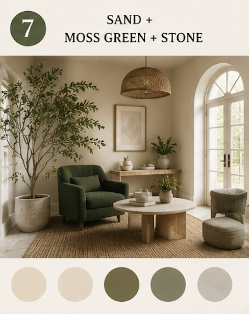
A deeper green hue is not to be feared! This moss accent chair is the statement piece of this room but it’s well-balanced by greenery from two small plants and a large, branch-y potted indoor olive tree. The jute rug and rattan light fixture pull together this ultra-natural look.
Inspired by forests and natural landscapes, this palette feels grounded and peaceful.
Soft sand tones keep the space light, moss green introduces depth, while stone-colored accessories tie everything together.
Layer in natural textures like woven baskets, jute rugs, linen throws, and leafy houseplants to complete the look.
Tips for Choosing the Right Color Palette
If you're not sure where to start, keep these simple guidelines in mind:
Choose one dominant neutral that covers most of the room.
Add one or two accent colors from the same family/tone, rather than several competing shades.
Repeat colors throughout the room to create a cohesive look.
Incorporate texture through wood, woven materials, ceramics, and fabrics to keep neutral spaces from feeling flat.
Bring in greenery. Plants naturally complement almost every color palette and make a room feel more alive.
Final Thoughts
A timeless home isn't about following every decorating trend—it's about choosing colors that make you feel comfortable and reflect your personal style.
Whether you're drawn to soft neutrals, earthy greens, or warm wood tones, these palettes provide a beautiful foundation you can build on for years to come.
Start with one room, add pieces gradually, and remember that the coziest homes are the ones that feel lived in and loved.
Happy decorating!
Potted + Styled Home